The Corona Virus – COVID-19 outbreak has brought the whole world to a stand still position, with complete lock-down in several countries. Salute! To every health and security professional. Today, we will attempt to perform a single data analysis with COVID-19 Dataset Using Python. Here’s the link for Data Set available on Kaggle. Following are the the Python Libraries we’ll be implementing today for this exercise.
The available dataset has details of number of cases for COVID-19, on daily basis. Let us begin with understanding the columns and what they represent. Column Description for the Dataset:
These are the columns within the file, most of our work will working around three columns which are Confirmed, Deaths and Recovered.
Let Us Begin: Firstly, we’ll import our first library, pandas and read the source file.
import pandas as pddf = pd.read_csv("covid_19_data.csv")
Now that we have read the data, let us print the head of the file, which will print top five rows with columns.

df.head()
As you can see in the above screenshot, we have printed the top five rows of the data file, with the columns explained earlier.
Let us now get into some dept of the data, where we can understand the mean and standard deviation of the data, along with other factors.
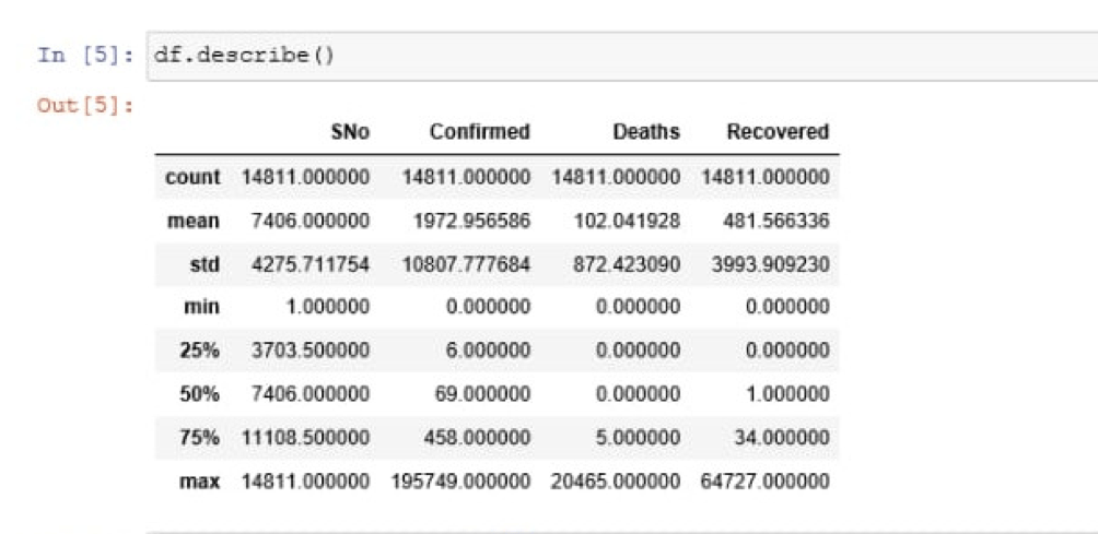
df.describe()

Describe function in pandas is used to return the basic details of the data, statistically.
We have our mean, which is “1972.956586” for confirmed cases and Standard Deviation is “10807.777684” for confirmed cases. Mean and Standard Deviation for Deaths and Recovered columns is listed, too.
Let us now begin with plotting the data, which means to plot these data points on graph or histogram. We used pandas library until now, we’ll need to import the other two libraries and proceed.
import seaborn as snsimport matplotlib.pyplot as plt
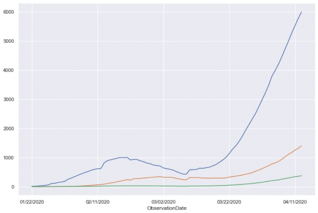
We now have imported all three libraries. We will now attempt to plot our data on a graph and output will reflect figure with three data points on a graph and their movements towards the latest date.
plt.figure(figsize = (12,8))

df.groupby('ObservationDate').mean()['Confirmed'].plot()

df.groupby('ObservationDate').mean()['Recovered'].plot()

df.groupby('ObservationDate').mean()['Deaths'].plot()
Code Explanation: plt.figure with initial the plot with mentioned width and height. figsize is used to define the size of the figure, it takes two float numbers as parameters, which are width and height in inches. If parameters not provided, default will be scParams, [6.4, 4.8].
Then we have grouped Observation Data column with three different columns, which are Confirmed, Recovered and Deaths. Observation goes horizontal along with the vertical count.
Above code will plot the three columns one by one and the output after execution will be as shown in following image.

This data reflects the impact of COVID-19 over the globe, distributed in three columns. Using the same data, we can implement prediction models but the data is quite uncertain and does not qualify for prediction purpose. Moving on we will focus on India as Country and analyze the data,
Let us specifically check the data for India.
ind = df[df['Country/Region'] == 'India']ind.head()
Above lines of code will filter out columns with India as Country/Region and place those columns in “ind” and upon checking for the head(), it will reflect the top five columns. Check the below attached screenshot.

Let’s plot the data for India:
plt.figure(figsize = (12,8))ind.groupby('ObservationDate').mean()['Confirmed'].plot()ind.groupby('ObservationDate').mean()['Recovered'].plot()ind.groupby('ObservationDate').mean()['Deaths'].plot()
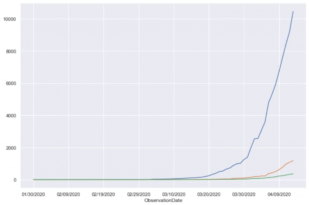
Similar to earlier example, this code will return a figure with the columns plotted on the figure. Output for above code will be:

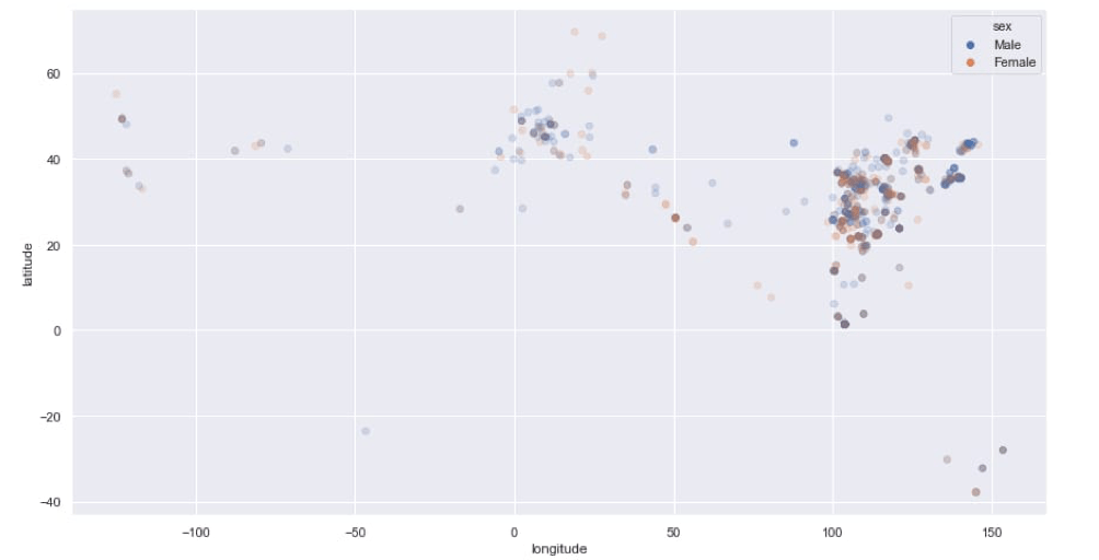
This is how Data is represented graphically, making it easy to read and understand. Moving forward, we will implement a Satterplot using Seaborn library. Our next figure will place data points, with respect to sex of the patient.
Code: Firstly we’ll make some minor changes in variables.
df['sex'] = df['sex'].replace(to_replace = 'male', value = 'Male')df['sex'] = df['sex'].replace(to_replace = 'female', value = 'Female')
Above code simply changes the variable names to standard format. Then we’ll fill the data points into the figure, plotting.
plt.figure(figsize = (15,8))sns.scatterplot(x = 'longitude', y = 'latitude', data = df2, hue = 'sex', alpha = 0.2)
Code Explanation: The “x and y” defines the longitude and latitude. data defines the data frame or the source, where columns and rows are variables and observations, respectively. The hue defines the variable names in the data and here these variables will be produced with different colors. alpha, which takes float value decides the opacity for the points. Refer the below attached screenshot for proper output.

Future Scope: Now that we have understood how to read raw data and present it in readable figures, here the future scope could be implementing a Time Series Forecasting Module and getting a Prediction. Using RNN, we could achieve a possibly realistic number of future cases for COVID-19. But at present, it could be difficult to get realistic prediction as the data we posses now is too uncertain and too less.
But considering the current situation and the fight we have been giving, we have decided not to implement Prediction Module to acquire any number which could lead to unnecessary unrest. Contact us for any business query
You must be logged in to post a comment.

This post is truly a nice one.
I blog frequently and I truly appreciate your content. The article has really piqued my interest.
I am amazed with the research you have made for this article. Fantastic job!
Very insightful article. Definitely sharing it.
As I website owner I think the subject matter here is very excellent, thanks for your efforts.
Remarkable! It’s a truly remarkable article, I have got a much clear idea from this article.
What an amazing blog!
Hi there. I discovered your website by way of Google whilst looking for a comparable subject, your web site got here up. I have bookmarked it in my google bookmarks to come back then.
I was reading through some of your articles on this website and I believe this internet site is real informative!